Today we introduced the first elements of what will be Tablesaw’s support for exploratory data visualization in pure Java. As Tablesaw expands its scope to integrate statistical and machine learning capabilities, this kind of visualization will be critical.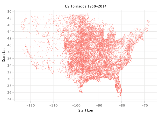 This slightly ghostly US map image was created by as a simple scatter plot of the starting latitude and longitude for every US tornado between 1950 and 2014. The code below loads the data, filters out missing records, and renders the plot:
Table tornado = Table.createFromCsv("data/tornadoes_1950-2014.csv");

tornado = tornado.selectWhere(
    both(column("Start Lat").isGreaterThan(0f),
         column("Scale").isGreaterThanOrEqualTo(0)));

Scatter.show("US Tornados 1950-2014",
    tornado.numericColumn("Start Lon"),
    tornado.numericColumn("Start Lat"));
These plots provide visual feedback to the analyst while she’s working. They’re for discovery, rather than for presentation, and ease of use is stressed over beauty. Behind the scenes, the charts are created with Tim Molter’s awesome XChart library: https://github.com/timmolter/XChart.
The following chart is taken from a baseball data set. It shows how to split a table on the values of one or more columns, producing a series for each group. In this case, we color the mark differently if the team made the playoffs. 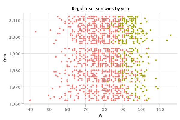
Here’s the code:
Table baseball = Table.createFromCsv("data/baseball.csv");
Scatter.show("Regular season wins by year",
    baseball.numericColumn("W"),
    baseball.numericColumn("Year"),
    baseball.splitOn(baseball.column("Playoffs")));
A chart that looks like a scatter plot and works like a histogram is a Quantile Plot. The plot below presents the distribution of public opinion poll ratings for one US president.
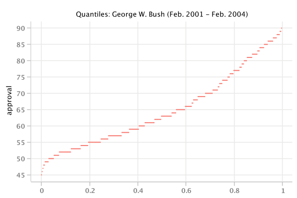
This chart was build using the Quantile class:
String title = "Quantiles: George W. Bush (Feb. 2001 - Feb. 2004)";
Quantile.show(title, bush.numericColumn("approval"));
Further down the line, I expect to add JavaScript plot support based on D3. These plots will be focused more on presentation, especially Web-based presentation, as Tablesaw becomes a complete platform for data science.

[…] a prior post, I showed how to create some native Java scatter plots and a quantile plot in Tablesaw. Since then, […]
LikeLike